@bsurdagraphic design, visual identity
Visual ID for @bsurda's 2025 Halloween
Context
@bsurda Halloween 2025
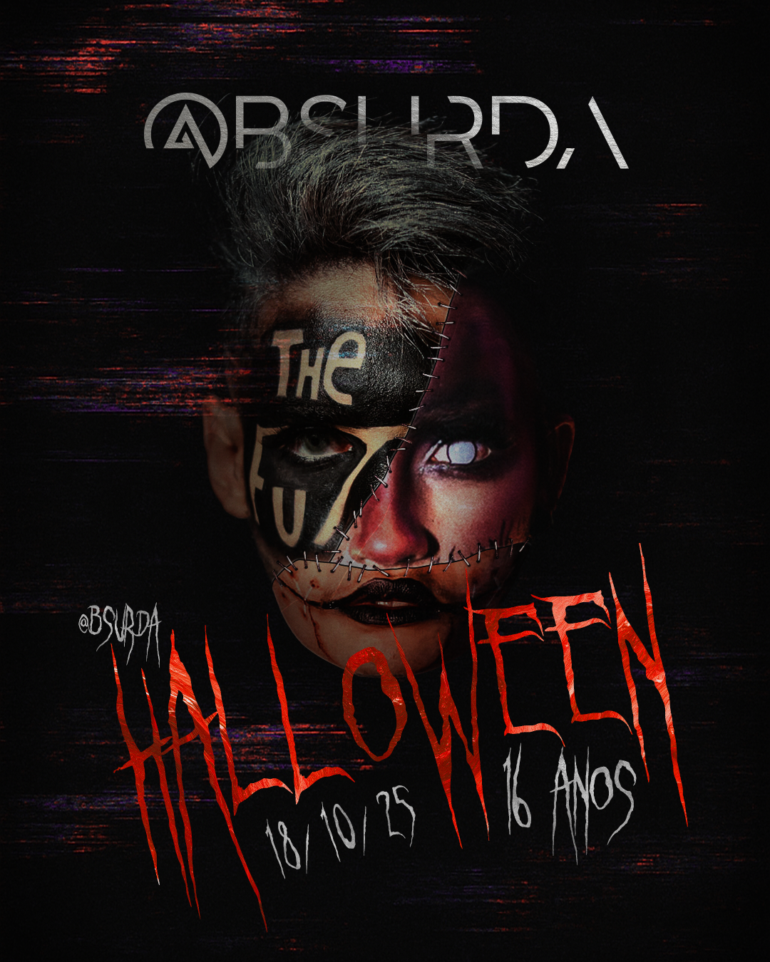
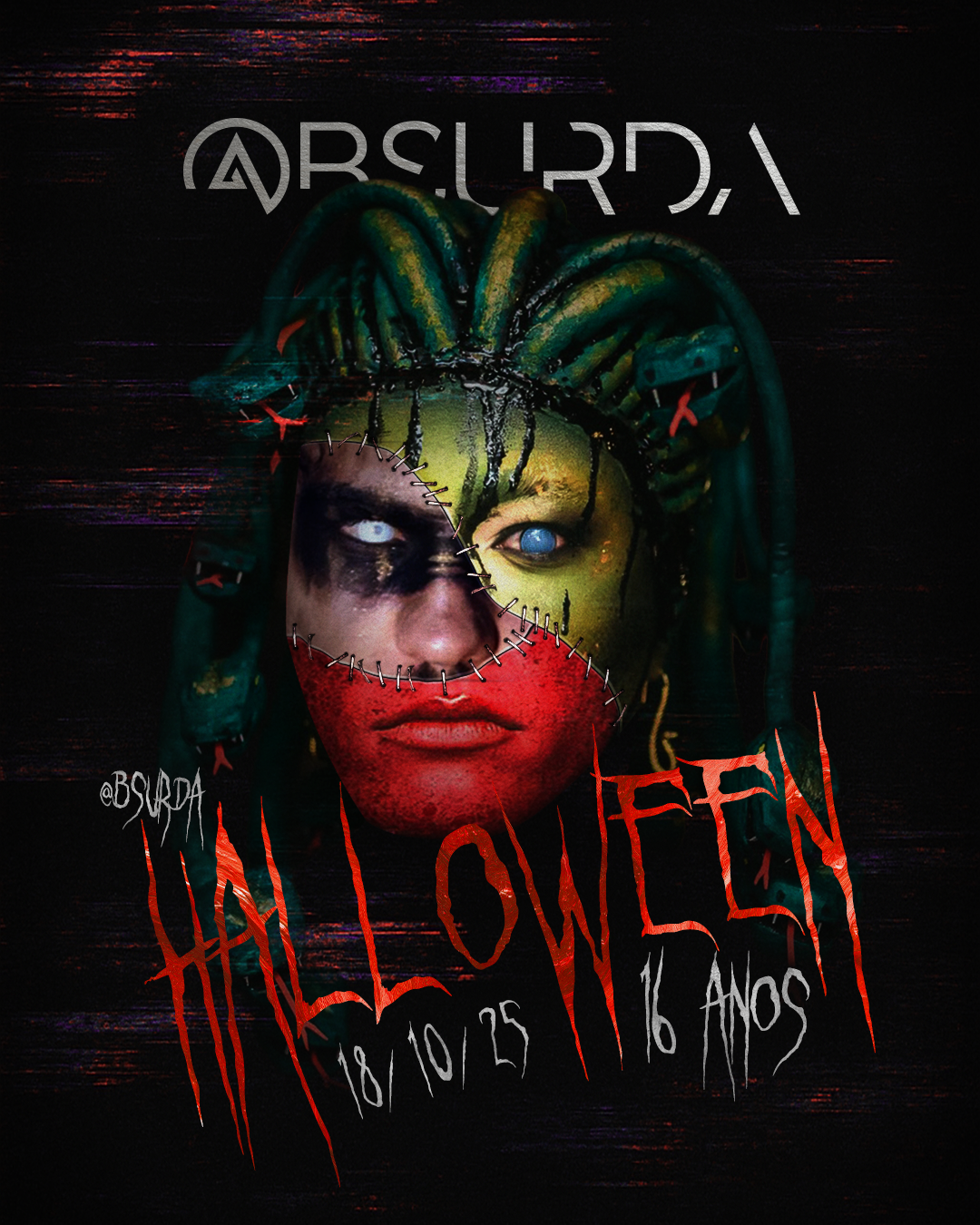
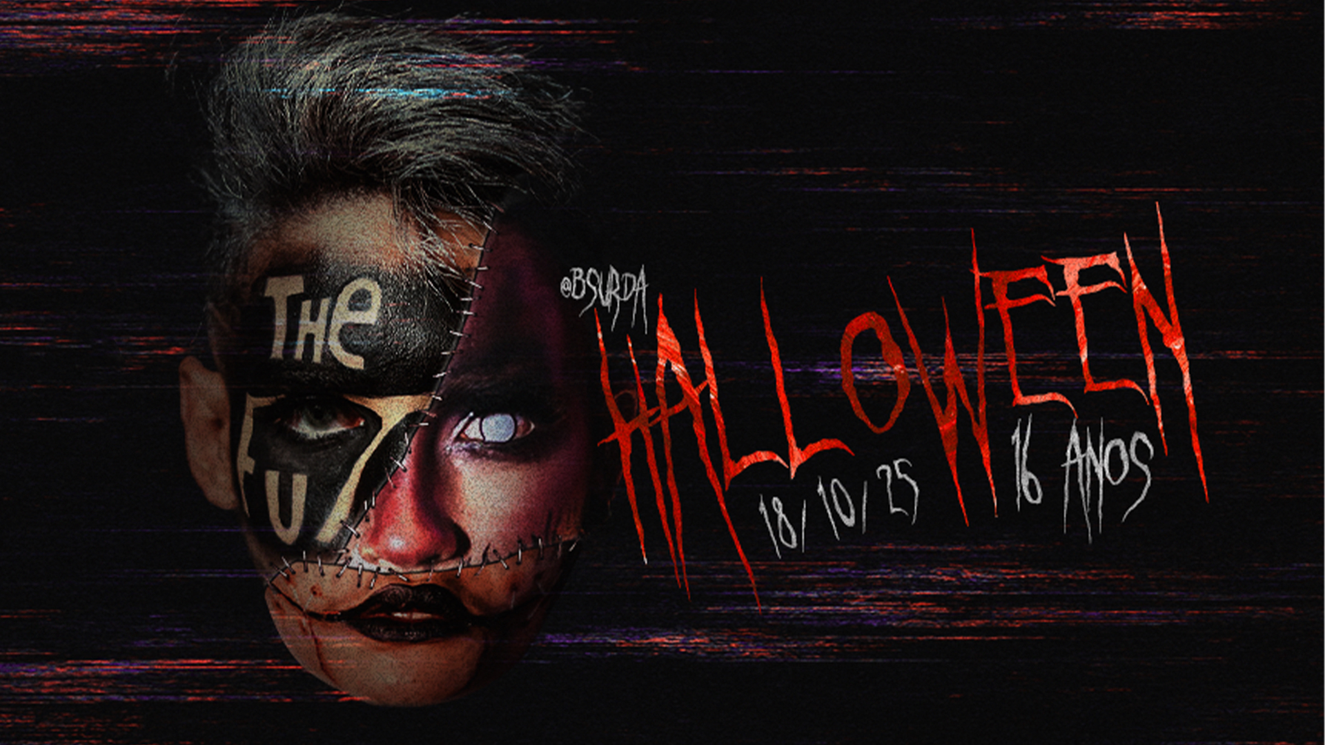
Halloween is @bsurda's biggest event of the year. The costumes people bring are consistently exceptional, full transformations, not afterthoughts. That was the starting point for the visual identity: build it from the community itself.
The reference
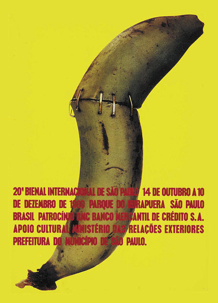
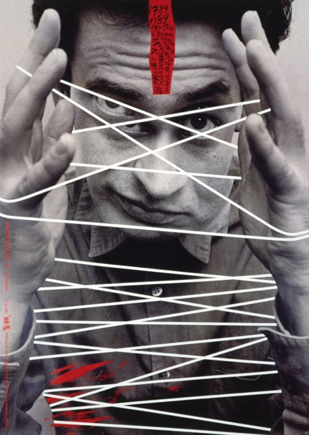
Going through Linha do Tempo do Design Gráfico no Brasil, I found two works side by side from the same postmodern moment in Brazilian graphic design. Rodolfo Vanni's 1989 poster for the 20ª Bienal Internacional de São Paulo takes fragmentation out of the graphic plane and into the physical world. The book describes it: "the chosen object for the operation was an indefectible banana", stitched back together with metal staples. Rico Lins' poster for the bicentenary of the Declaration of the Rights of Man and of the Citizen applies the same logic differently: white strips cutting across a face, the body as something that can be taken apart and reassembled. Both pieces treat the body as raw material. Both use physical intervention as the design act.
The work
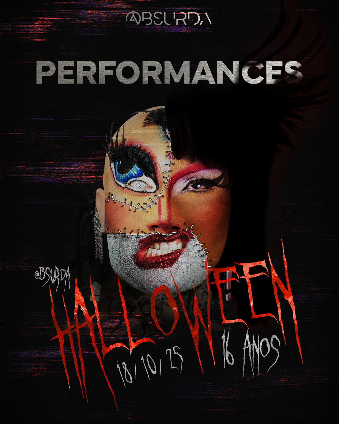
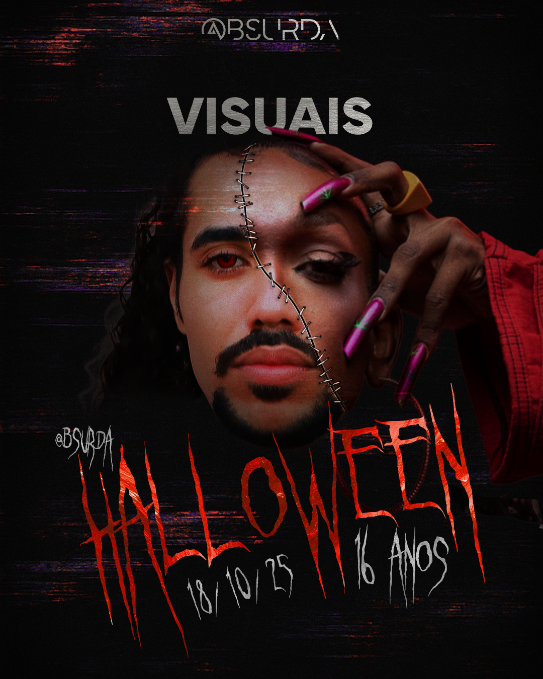
I built composite faces from photographs of real attendees in costume from past events. Each one combines multiple people through organic, varied cuts, stitched together with Vanni's own staples lifted directly from the poster. Different costumes, different years of the event's history, held together by a design element from a canonical Brazilian work. The system ran across the main poster, stories, artist announcements, and category cards. Every piece uses the same construction logic. The raw material was our own community. The reference was Brazilian. The craft was in the combination.