wig eventsgraphic design, visual identity
An identity update for wig events
Context
The company
wig events is a drag event production company based in Belo Horizonte, Brazil, headed by a drag queen. They produce brunches, parties, and drag theatre shows. By 2024 the company had grown significantly and its original identity couldn't keep up.
The Logo
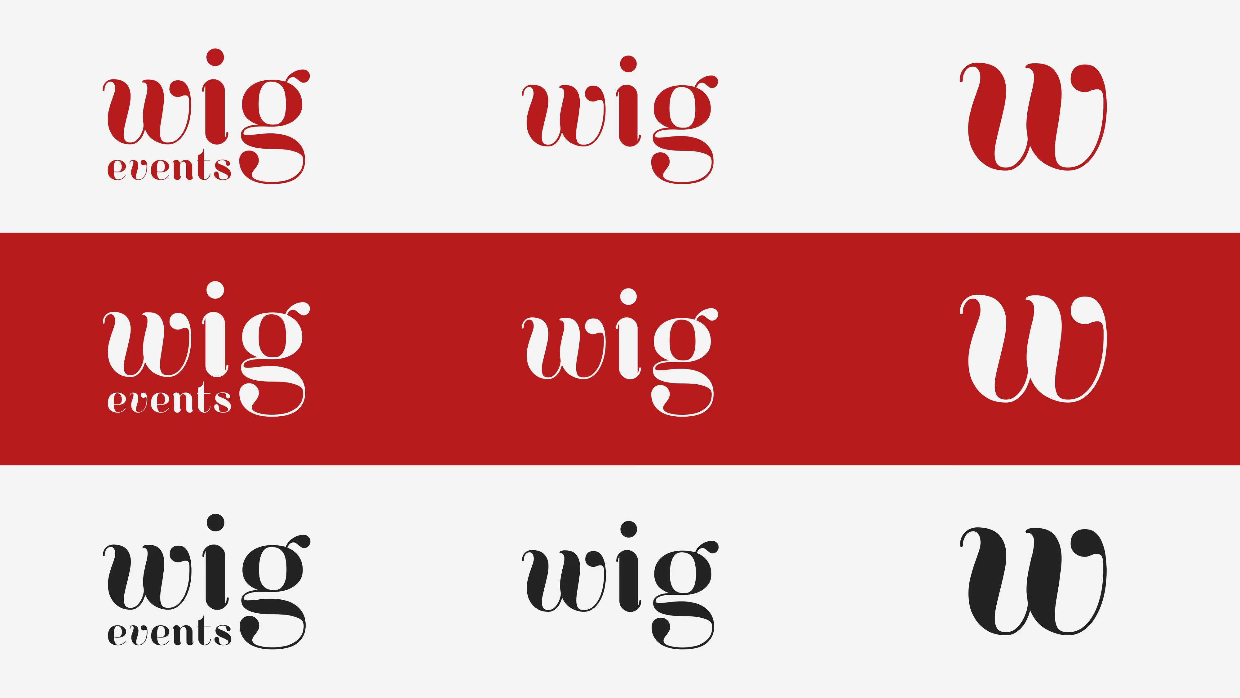
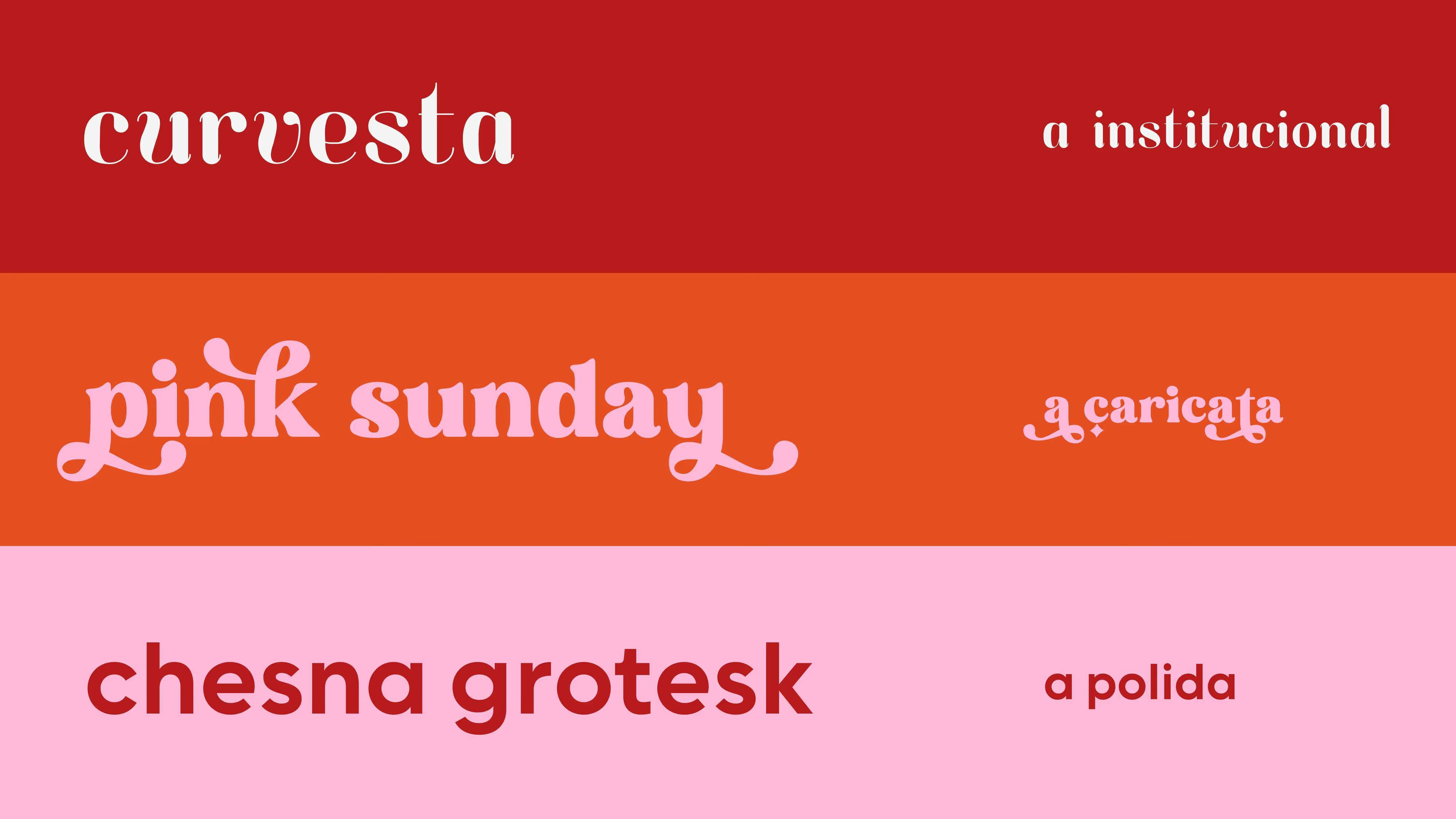
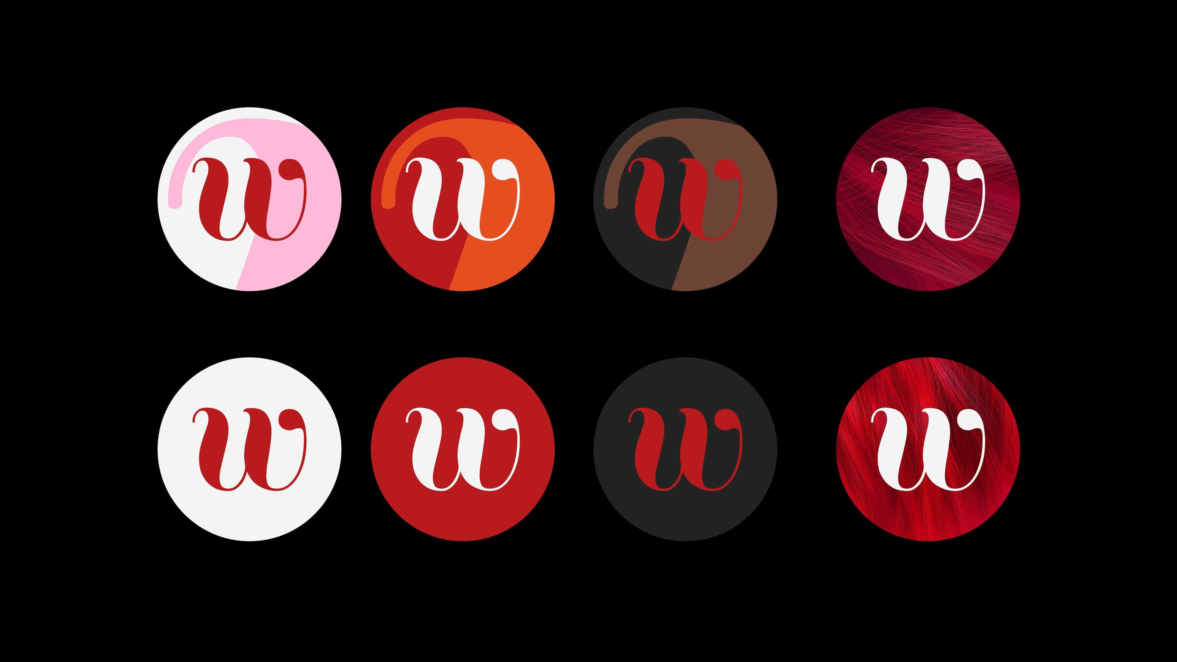
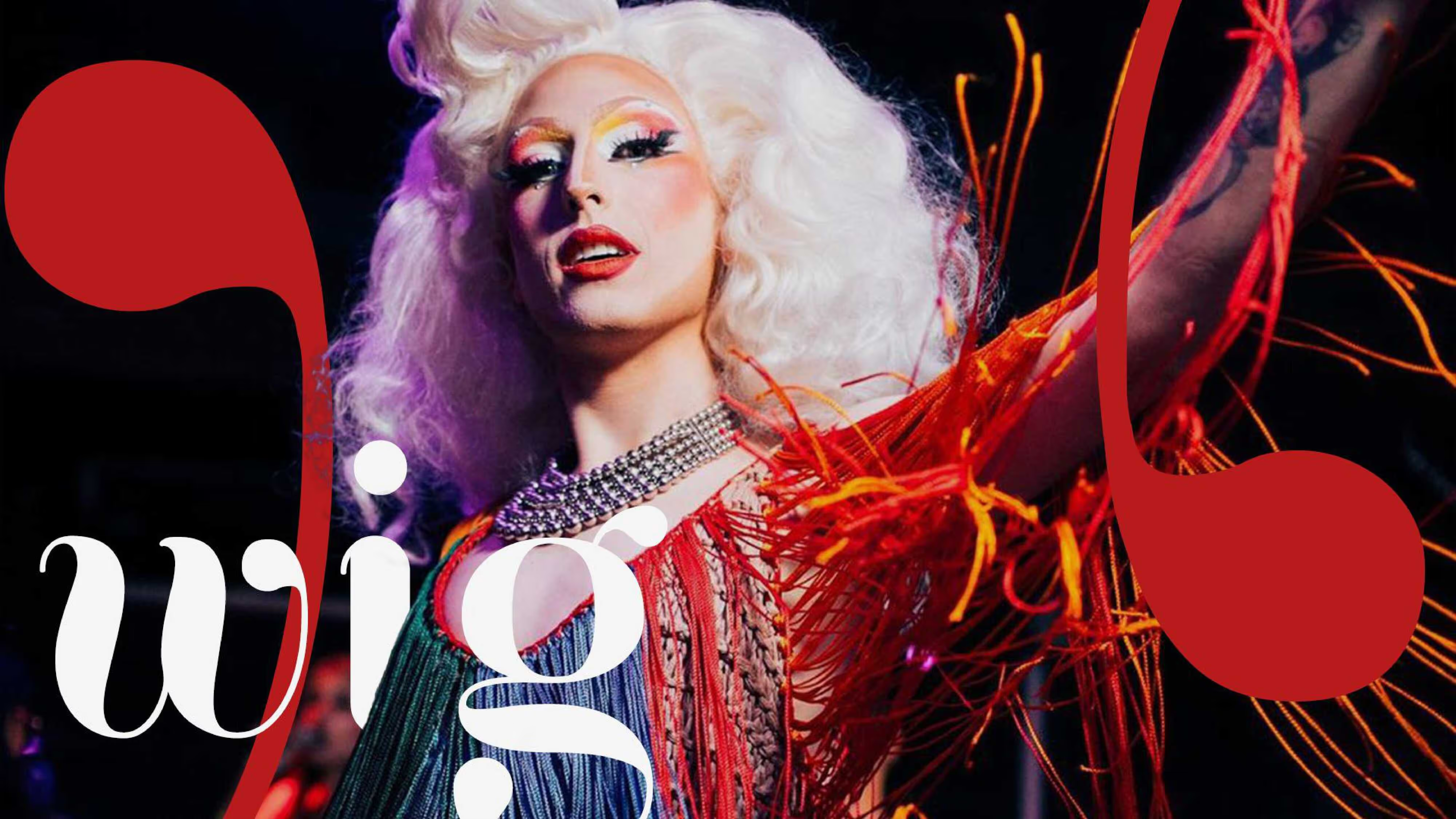
The original WIG, uppercase and contained in a red rectangle, felt more like an announcement than a personality. It gave way to a lowercase wordmark in Curvesta, a high-contrast serif with expressive curves that carries weight while feeling alive. The "w" became a visual asset in itself, used large across applications as a graphic element.
Type system, colours and Applications
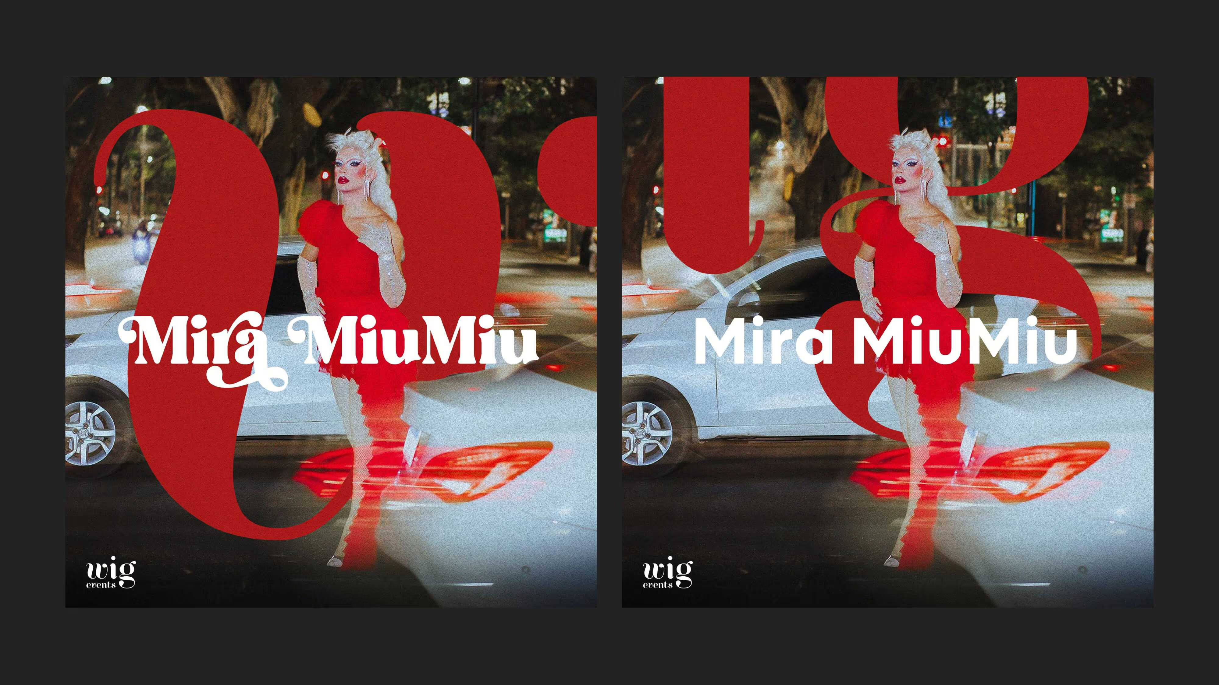
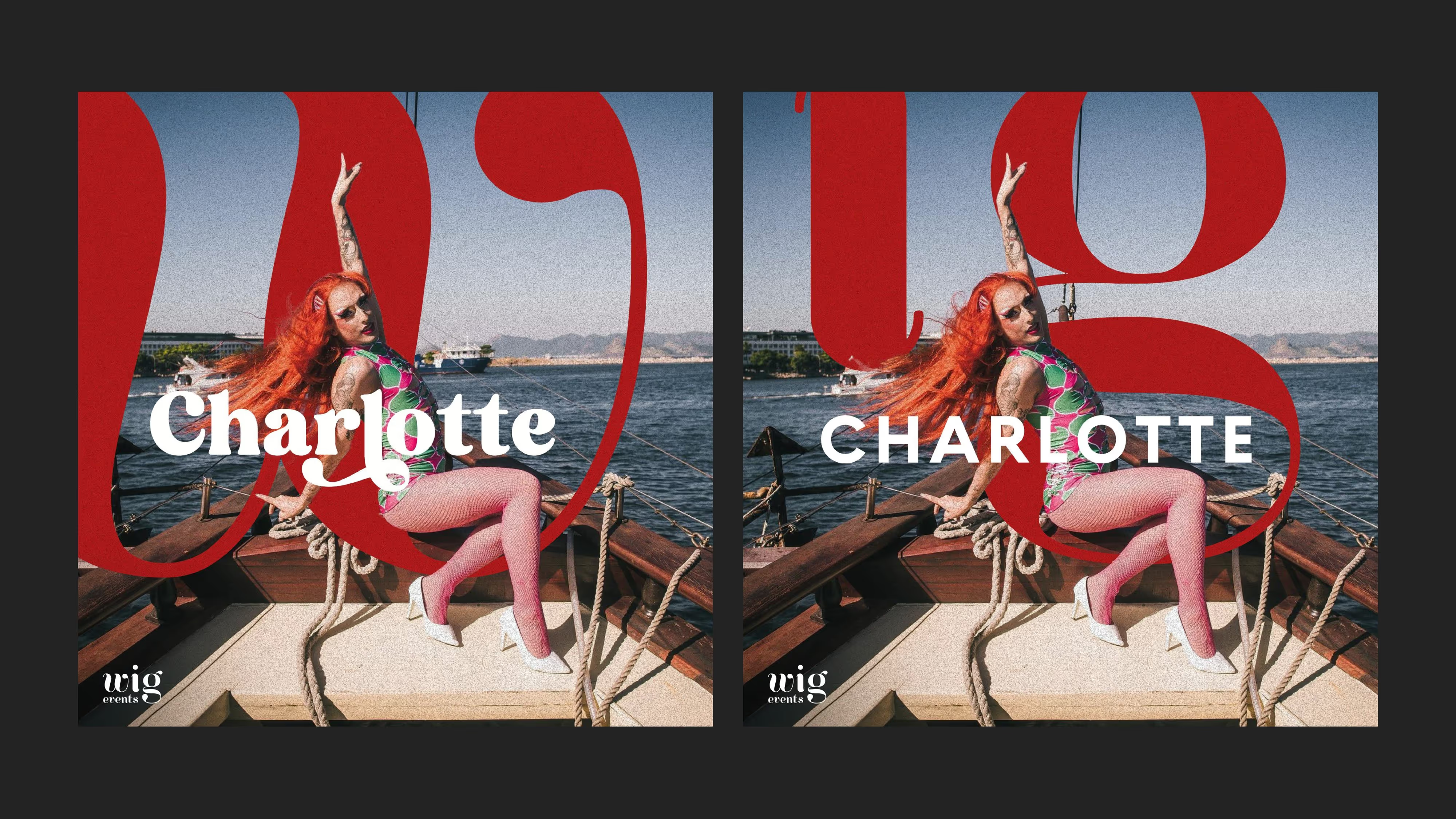
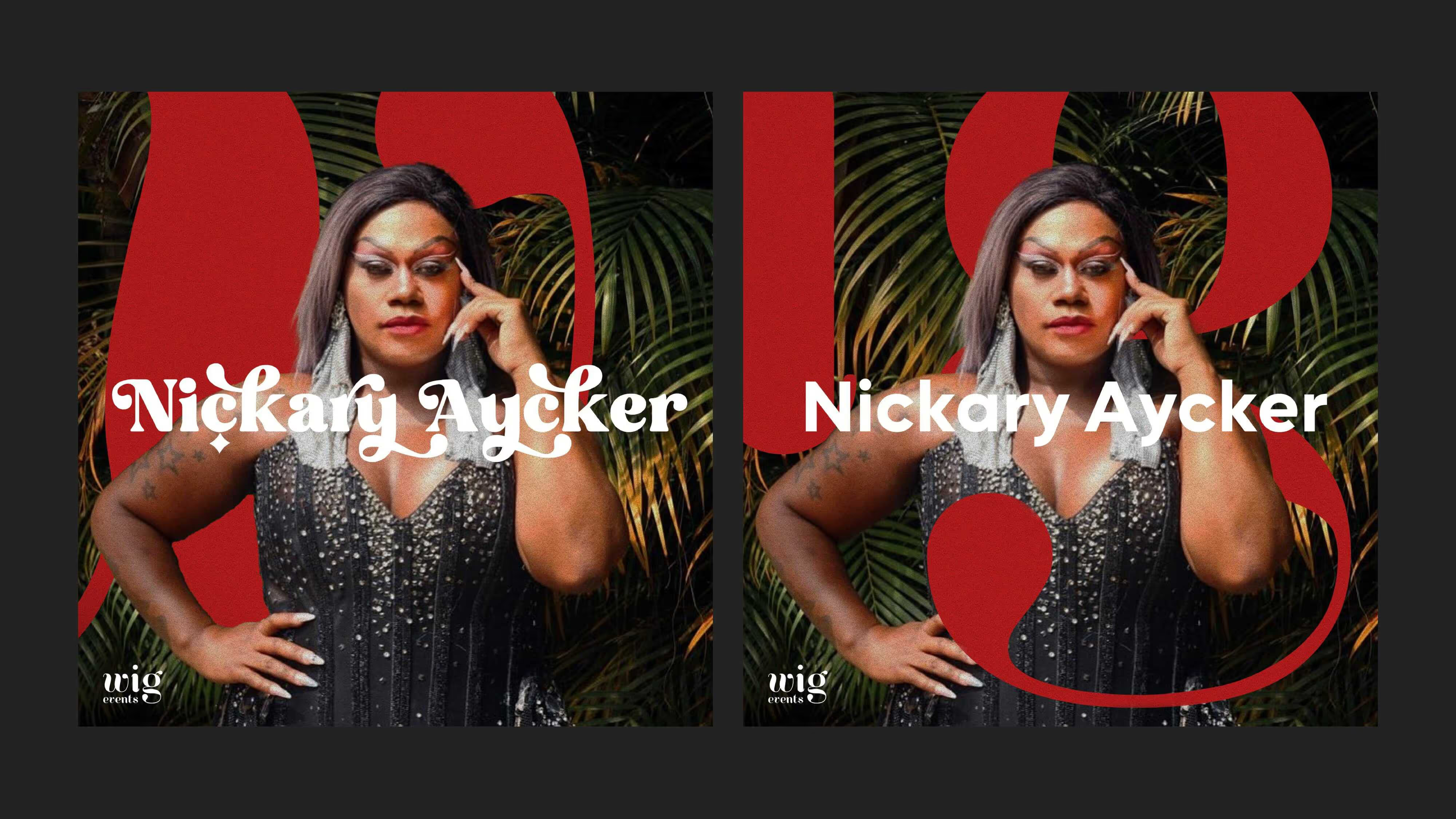
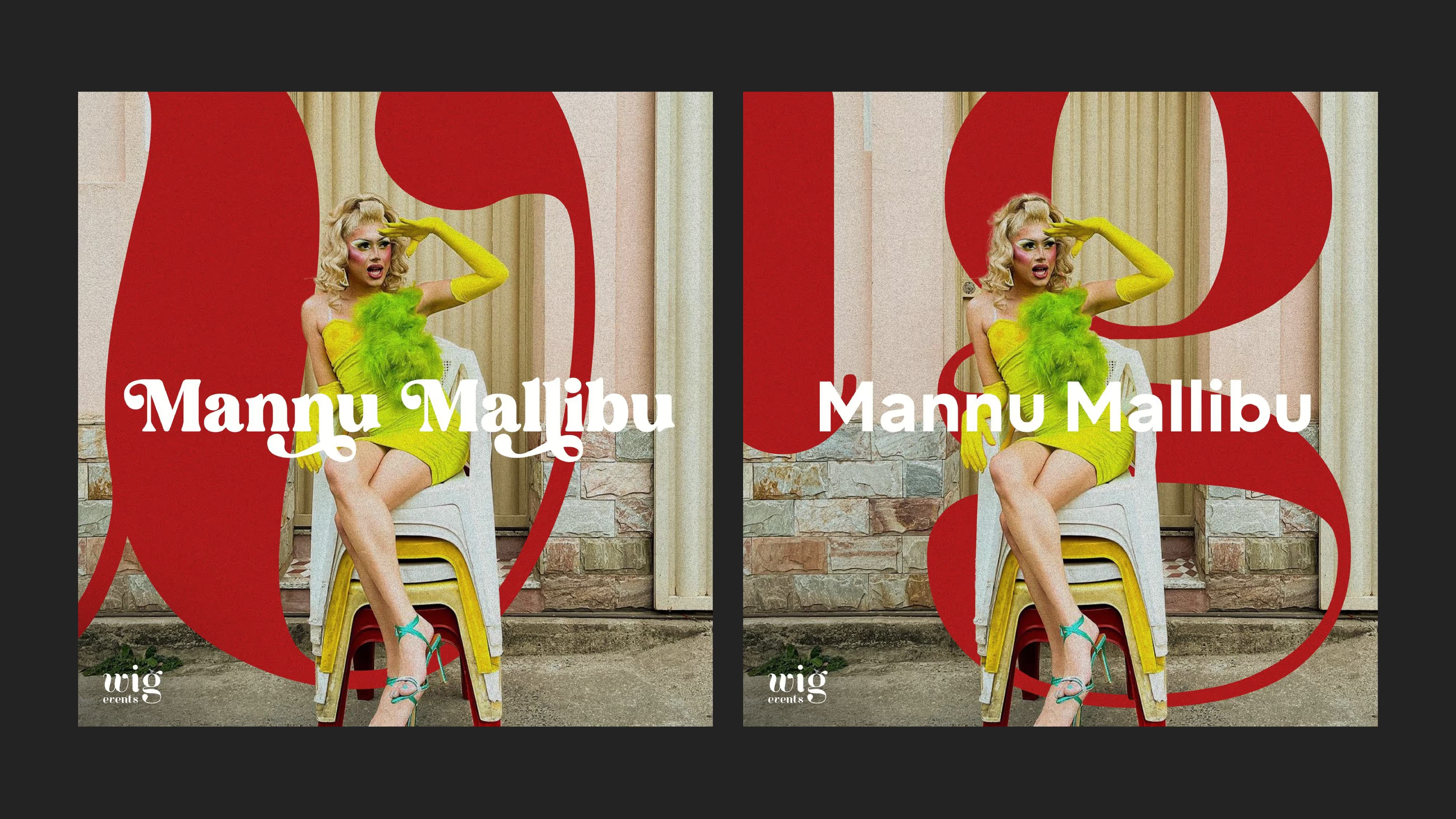
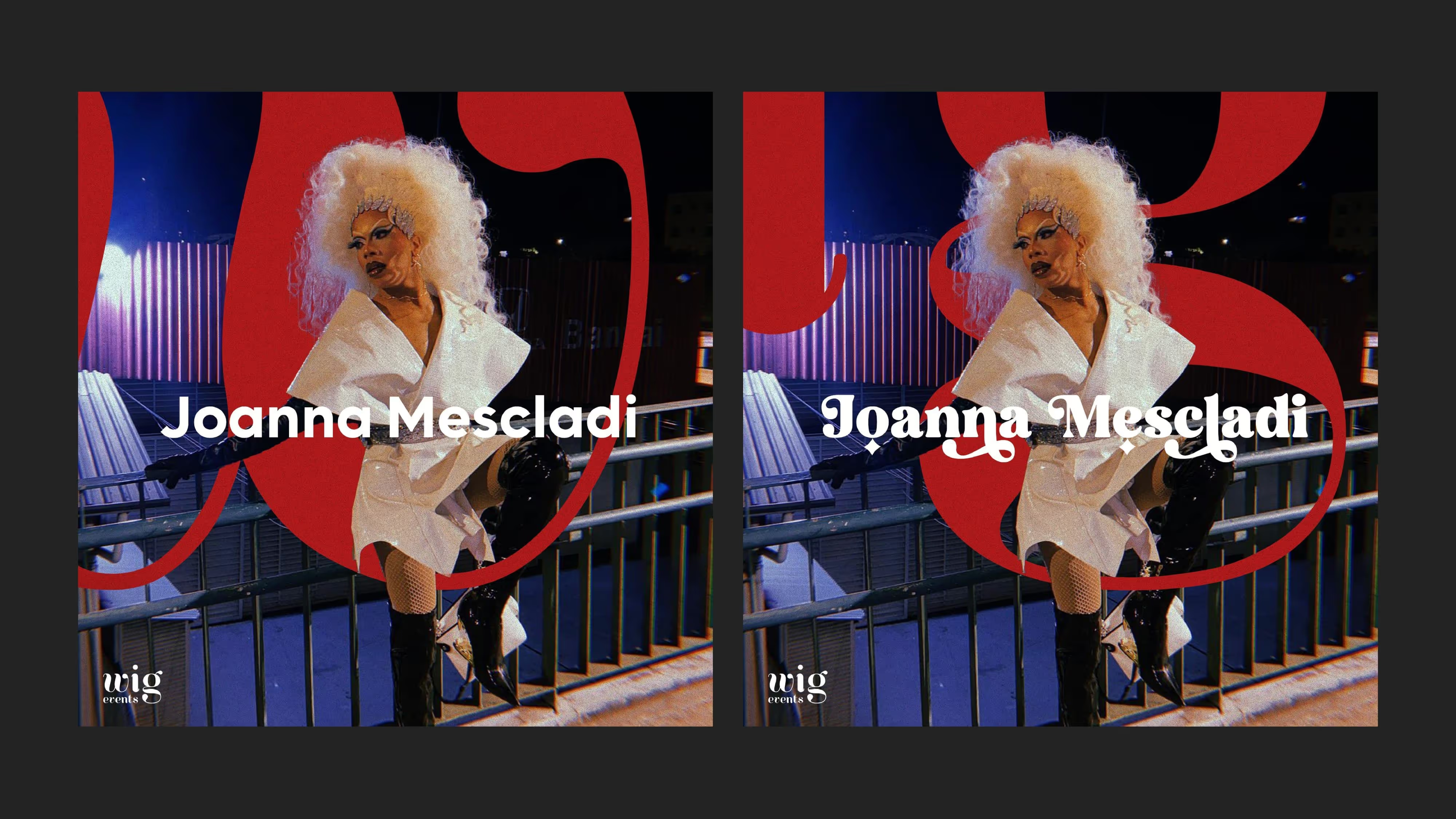
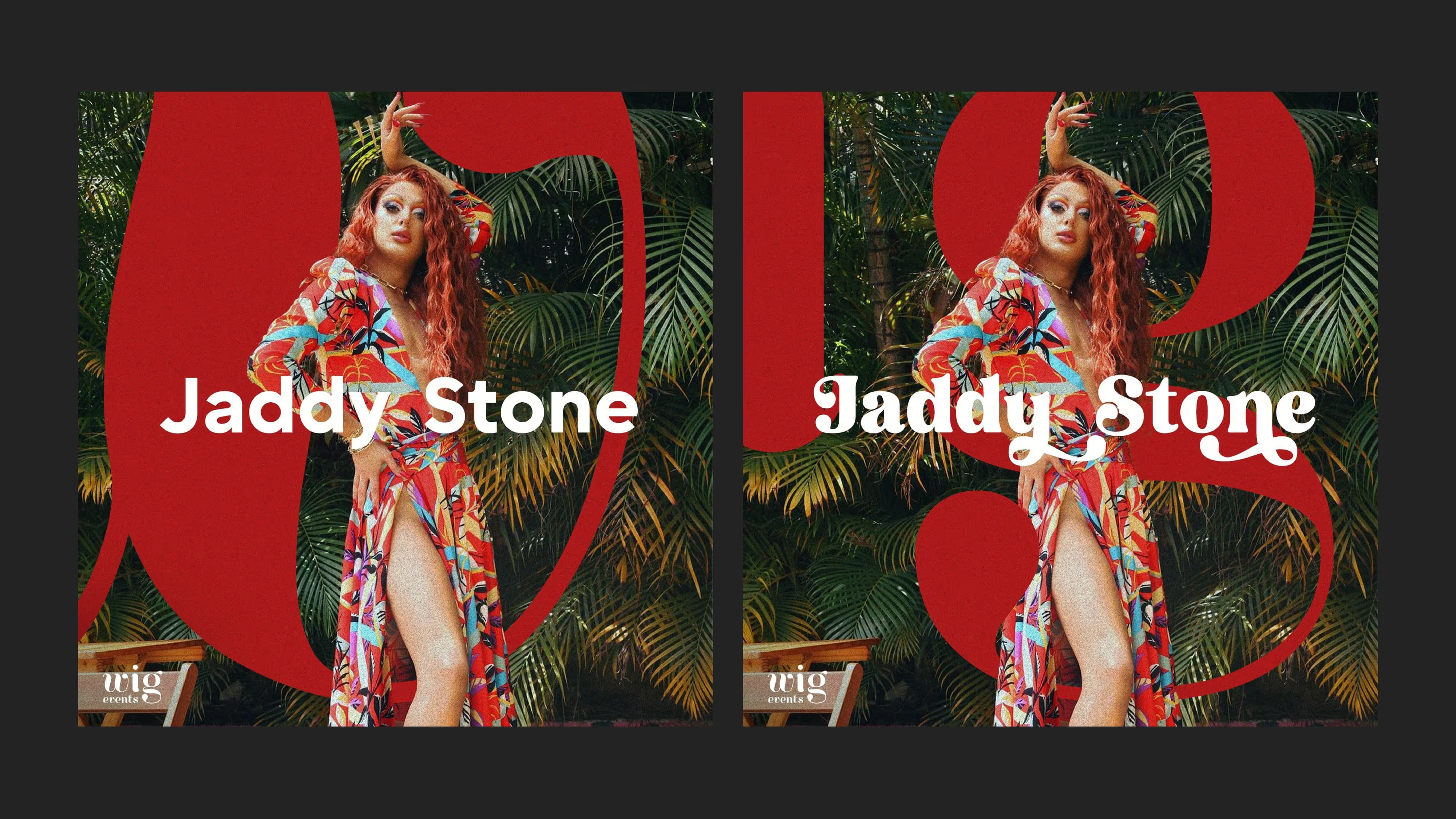
Sub-brands, event posters, artist cards, and social content, with enough flexibility to stretch from intimate brunch events to large-scale shows.
Project
Figma presentation currently only available in Portuguese. English version coming soon