Overview & Outcomes
The initiative already existed when I joined. The product direction did not.
Prior attempts had focused on grouping protections for revenue. What was missing was a coherent product model users could actually navigate. I reframed the problem around comprehension and trust, led end-to-end research and design, and coordinated across multiple squads and backend systems to ship a new booking step that generated a sustained nine-figures annual revenue uplift and became a leading driver of revenue growth for the company.
Legacy systems weren’t designed for bundled offerings while confusing protection options caused decision fatigue, blocking critical revenue opportunities and eroding user trust during booking.
Why this mattered
Without fully bundling, we were missing out on significant revenue gain potential in a moment financial challenges for the company.
Booking confusion eroded user confidence in Localiza’s transparency, putting long-term customer relationships at risk.
This wasn’t just about immediate revenue; we needed to lay a foundation for scalable cross-sell strategies across Localiza’s ecosystem.
Key Outcomes
Establishing the feature as a leading driver of revenue growth.
Providing proof of concept, extra revenue and data for more complex future versions.
In user complaints about protections and removal requests at pickup counters.
*data cannot be shared
My Approach
Led end-to-end design research, synthesizing historical data and fresh user insights to craft our approach. The central move was reframing the challenge from "how do we sell grouped protections" to "how do we make coverage choices easier to understand, compare, and trust."
Coordinated multiple teams (enabling systems, pricing sources, mobile/web channels) under tight technical and timeline constraints.
When stakeholder confidence faltered, I pivoted to quantitative testing, turning a potential crisis into an opportunity for stronger validation.

Problem Space
Navigating this space meant balancing complex system dependencies and pressing timelines with a clear-eyed look at how unclear protection rules and overwhelming choices impacted users. Insights about mental models, cognitive load, and language clarity shaped every design decision.
Context & Constraints
Earlier attempts at grouping protections existed before I joined, but they were incomplete and still confusing to users. My role was to reframe the problem, align stakeholders on a viable V1, and turn a broad commercial initiative into a coherent product direction.
Prior to this innitiative only protections could be bundled together.

The project spanned multiple back-end systems with interdependencies and data touchpoints. Each system had its own logic and limitations, making cohesive design and data accuracy a constant challenge.
As a key initiative for 2024, bundling couldn’t wait. We needed to deliver quickly without compromising the clarity and reliability users needed.
With multiple teams involved, each with unique perspectives and constraints, success depended on constant alignment and active negotiation.
Key Insights from Research
Prior attempts treated this as a monetization problem. The research showed it was a trust and comprehension problem. That reframe changed everything about the solution.
Our protection model was designed for operational flexibility, but users expected familiar insurance-like tiers. This mismatch created a gap between user expectations and how our products actually worked.
Mixing bundled and standalone items created unnecessary complexity, especially on mobile. Users felt overwhelmed and lost confidence in their decisions.
When users couldn’t see exactly what was included in protections, they assumed information was being hidden. This perception of opacity damaged trust.
Internally focused product names and terms didn’t resonate with users. The mismatch between what users saw and what they expected to see created friction at the point of decision.
Strategic Challenges
We had to balance the risk of patching legacy systems with the need for scalable, future-ready solutions. This tension was central to every design and technical decision.
Negotiating competing priorities between business, design, and engineering teams while staying laser-focused on user needs. The stakes were high, and every decision had to consider impact on revenue, experience, and future iterations.
Design Process & Decisions
Our focus was to prioritize what would drive immediate impact, while laying a modular foundation for future improvements. Along the way, we faced high-stakes stakeholder challenges that demanded quick pivots, like moving from qualitative to quantitative testing, to ensure decisions were data-backed and user-centered.
Research Foundation
Synthesized 2+ years of user feedback, support tickets, and NPS data to understand pain patterns.
Conducted rapid in-agency testing to validate assumptions and fill knowledge gaps efficiently.
Interviewed support agents who dealt with confused customers daily. Their frontline perspective was invaluable.
V1 Strategy & Tradeoffs
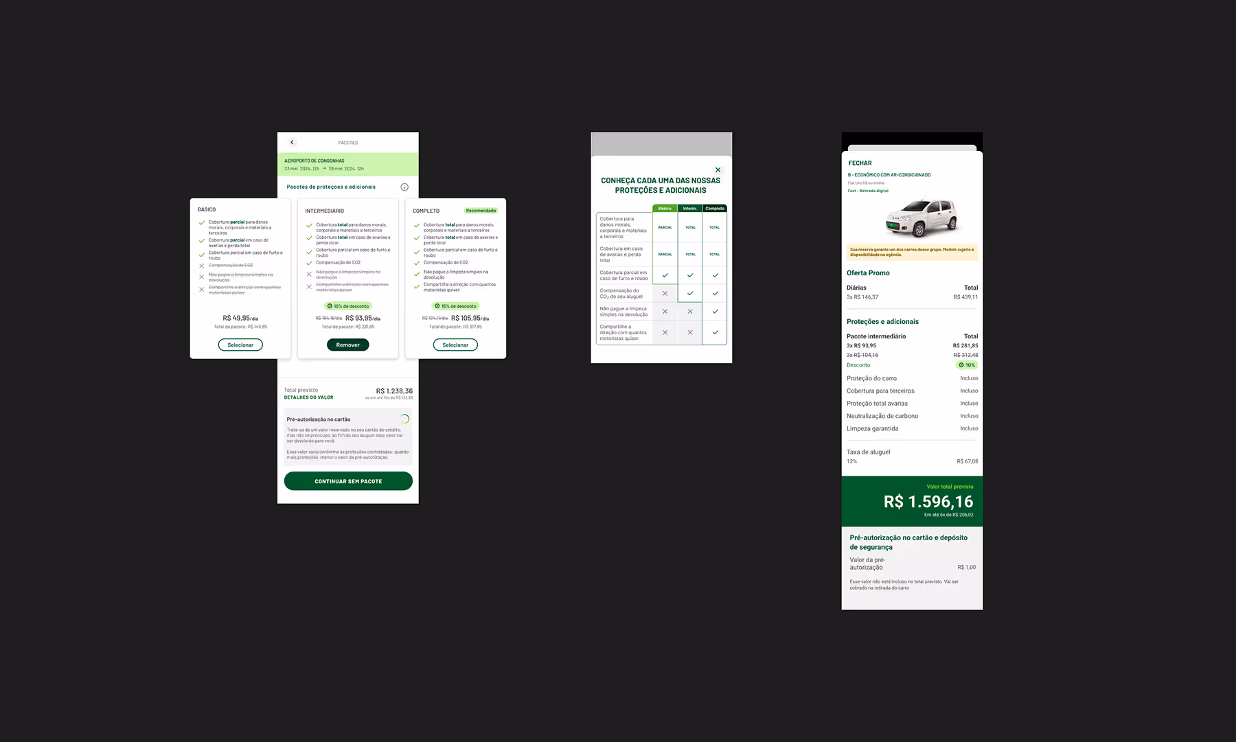
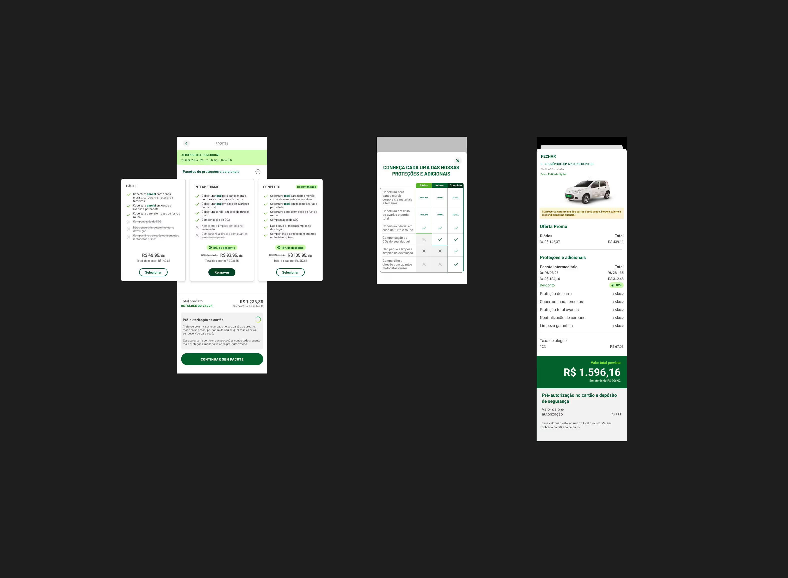
Separate bundle logic from standalone logic. Make package tiers easier to compare. Reduce hidden state changes. Preserve user agency while supporting business goals.
Designed components that could be built independently and assembled like Lego blocks, reducing dependencies and risk.
Created a clear hierarchy: what must ship in V1, what could follow quickly, and what belonged in the long-term vision.
Ensured that even if only core components shipped, the experience would still be functional and better than the status quo.
Stakeholder Conflict
Directors questioned the validity of qualitative findings and demanded a risky production test to validate if users were aware they could go on without choosing any package.
Proposed and led a rapid Maze test to gather quantitative evidence, turning skepticism into momentum for data-driven decisions.
Framed it as risk mitigation: "Let's get data that makes everyone confident, without disrupting development or risking revenue."
Quantitative Validation
Created 4 variants testing our key assumptions: 3 vs. 4 cards, with/without pre-selection.

Information accessibility mattered more than card quantity. When users could easily find the "no pack" option only a single-digit share missed it vs. one-third when hidden
Pre-selection backfired: it pushed 7 to 14 percentage points more users toward the cheapest option, while mid and top tier packages fell by 4 to 16 percentage points. The financial result of pre-selection would have been negative.
Final Design Decisions
Data proved that empowering choice led to higher-value selections, aligning user autonomy with business goals.

The fourth card added minimal value while increasing complexity and development cost.
The "no pack" alert was our compromise, addressing business concerns while maintaining user agency. With around 1 in 5 conversion rate, it proved highly effective.
Impact & Legacy
The results went beyond revenue: we saw meaningful improvements in user understanding and satisfaction. Early learnings from this project set the stage for ongoing iterations, with scalable patterns and a stronger foundation for cross-sell across Localiza’s ecosystem.
Final V1.1 Solution
Delivered a clean, simplified interface using modular components, clear separation between bundled and standalone options, and an alert system that supported transparency without overwhelming users.
Streamlined the experience to help users make confident choices about protections, directly reducing confusion and complaints.
Measurable Impact
Scaled the feature from a successful launch into a sustained, nine-figure additional annual revenue stream, establishing it as a leading engine for business growth.
Drove a significant and sustained lift in the average revenue-per-transaction by continuously optimizing the add-on flows for clarity and value.
Established a repeatable framework for cross-sell opportunities and demonstrated how user research drives bottom-line results.
First Iteration Improvements
Introduced an interactive comparison table, helping users navigate choices more easily, especially on mobile.

Refined interaction hierarchy in modals and flows, guiding attention and reducing cognitive load.
Learnings
We had scope alignment, but not enough alignment on how evidence would override opinion once the work became more concrete. In a project with this many stakeholders and dependencies, that framework needs to be explicit before things get contentious.
Qualitative research got us to the right design direction. But we only gained full organizational confidence once we added quantitative validation.
Some compromises were necessary. Some were only expedient. I'd push harder before launch on the ones that were already likely to create friction, comparison support being the clearest example.
Next Steps & Legacy
V2 will focus on expanding comparison capabilities and reworking protection names for even clearer communication.
Bundling components are now part of Localiza’s design system, enabling scalable future improvements.
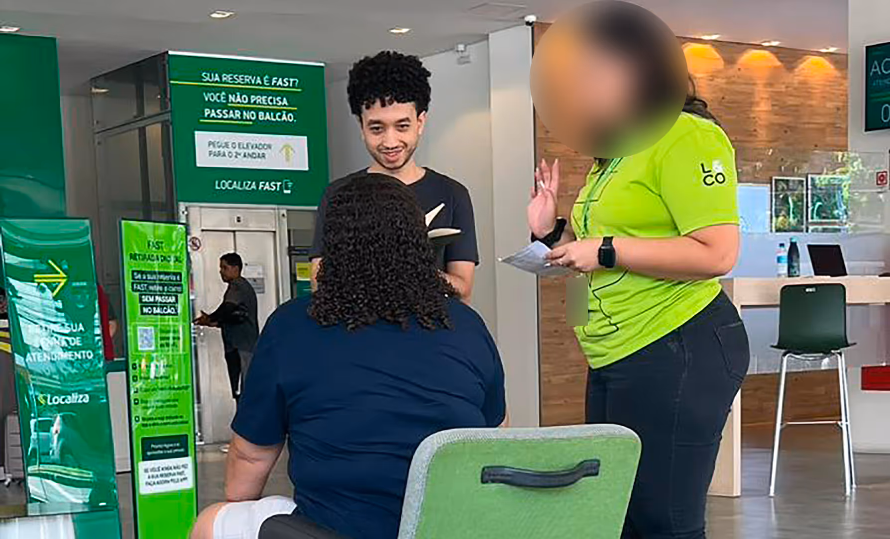
The project shifted how teams at Localiza approach design-led decisions. One concrete signal: physical branch counter agents adopted the comparison table as an active sales tool, using it to walk customers through coverage tiers at pickup.


.svg)