Overview & Outcomes
For years, Localiza offered progressive monthly rental discounts exclusively through phone and in-person channels, leaving online customers without access to significant savings and operational value on the table. When the initiative to bring this capability digital stalled mid-development, I was brought in to diagnose the problem, reframe the approach from "inform users" to "let users explore and apply," and coordinate delivery across five squads before a hard seasonal freeze deadline.
Progressive monthly discounts existed only through phone or in-person counter bookings. Users couldn't see or benefit from these incentives online, leaving revenue on the table and cars idle in yards.
The solution
I designed an in-flow re-quotation calculator that updates the live quote as customers extend rental months, making the discount structure transparent and the value proposition immediate.
Key Outcomes
on the in-flow calculator
and more than doubled long-term rental volume in the first month post-launch
proving progressive discounts changed booking behavior
across five squads before high-season freeze
*Additional metrics confidential
Context
Progressive monthly discounts had been offered at every Localiza branch for years — but only in person or over the phone. Leadership directed the product organization to bring this capability online as part of a strategic push to scale monthly rentals through digital channels.
We had a hard deadline: ship before high season began. Localiza freezes all new feature releases during peak booking periods to avoid disruption during the most revenue-critical months. Missing this window meant waiting an entire season.
When I returned from vacation, the project had been in progress for weeks with minimal design involvement. The pricing squad had nearly completed their engine and expected design to figure out how to "explain" the discounts to users through better copy and layout.
- 1.5–2 months until feature freeze
- 3 weeks available for design work
- All squads needed to complete development before the deadline
I was brought in to unblock the initiative and get it across the finish line.
This wasn't a single-squad effort. The internal structure required coordination across:
- Pricing squad: owned discount logic and calculation rules
- Data & bookings squad: processed reservations from all channels
- App squad: my primary responsibility, accounting for 70%+ of all digital bookings
- Site squad: web experience
- Chatbot squad: conversational booking flow
Each channel talks to the backend squads (pricing and bookings) independently, meaning any change required synchronized updates across five teams.
As the designer for the app — the dominant digital channel — I led the design strategy across all digital surfaces. The app's volume made it the primary success metric, but site and chatbot needed the same solution to maintain experience consistency.
Offline, agents could explain progressive discounts in real-time, adjusting offers based on customer questions. Online, customers had no visibility into these incentives, no way to explore scenarios, and no confidence in how monthly pricing actually worked. The friction forced users to either call in (operational cost) or book shorter periods (missed revenue).

Problem & Research
Problem space
The business offered progressive discounts for longer rentals — but only through human-assisted channels. Online customers had no visibility into these savings, forcing them to either:
- People booked shorter periods and re-booked multiple times (operational waste)
- Call the counter to manually negotiate (poor experience)
- Miss the discount entirely (lost revenue)
For users, the problem extended beyond missing discounts:
- Monthly vs. daily mental models didn't align with how pricing was displayed
- Security deposits and mileage allowances were buried or unclear
- No way to explore "what if" scenarios before committing
The company needed to bring this pricing flexibility online before the high season, requiring tight coordination across pricing systems, reservation flows, mobile, and web — all while avoiding a feature freeze.
What I learned from research
I analyzed phone and counter booking patterns, operational data, and cross-channel performance to understand:
Long-term renters mentally budget per month. Showing "R$X per day × 90 days" created cognitive friction.
When phone agents explained month-by-month savings, customers consistently extended rentals. Online users never saw this value proposition.
Many users abandoned or called after realizing total mileage limits weren't clear upfront.
Many users abandoned or called after realizing total mileage limits weren't clear upfront.
My Role & Strategy
Reframed the brief from "inform users about discounts" to "let users explore and apply discounts in-flow." I made the case that an announcement wouldn't change behavior — we needed a calculator, not a tooltip.
Established shared delivery principles across app, web, pricing engine, and reservations teams through sync meetings and shared documentation. Created a unified decision framework so each squad could move independently without waiting for design review on every component.
Defined what ships in MVP, what moves to Next, and what goes to Later. When Pricing pushed to add comparison tables and Legal wanted expanded disclaimers, I held the MVP boundary: "We're shipping the calculator and monthly framing. Everything else waits for validation data."
When I joined the project, the pricing squad presented their nearly-complete engine implementation in a cross-team sync. Their approach: show discount information without actually changing the quote during booking. Their reasoning was capacity — they hadn't allocated engineering time to rebuild the quotation structure and expected design to "solve it with better explanations."
I pushed back directly:
"This won't work during booking. Inform-only can happen after booking, before pickup, but not in the flow. If the quote doesn't update in-flow, design will not approve this solution. We only proceed if the quotation changes."
This wasn't negotiable. Users needed to see the discount applied in real-time, not described in a tooltip. No amount of clever copy could compensate for a quote that didn't reflect the value being offered.
The pricing squad had to reprioritize their capacity. It delayed the initial timeline by two weeks, but it was the right call — the solution worked because the calculator actually changed the quote.
Connected each design decision to business outcomes in stakeholder readouts:
- Discount discovery → duration uplift
- Monthly clarity → reduced support calls
- Mileage visibility → fewer pickup reversals
This framing turned UX goals into commercial goals, securing buy-in from teams who initially saw this as "just a UI change."


Solution & Decisions
Here's how I translated insights into a transparent, actionable experience:
Key Design Decisions
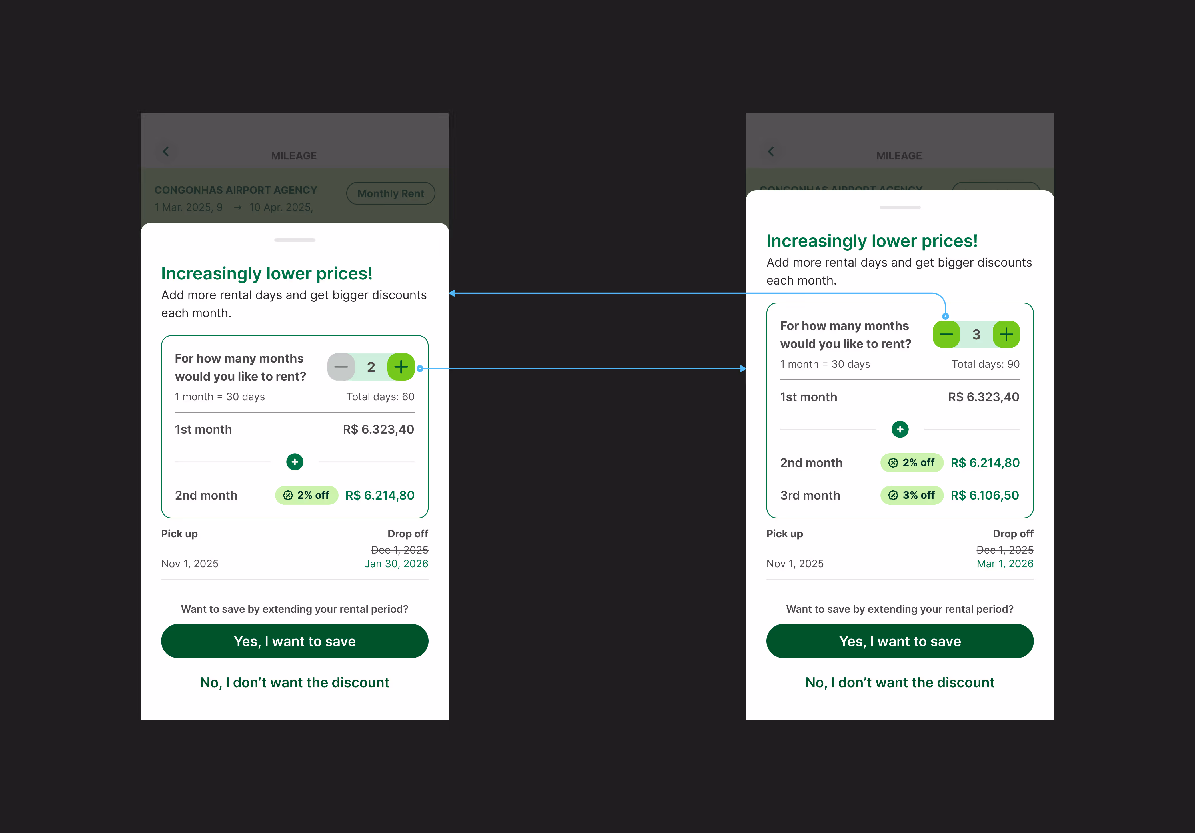
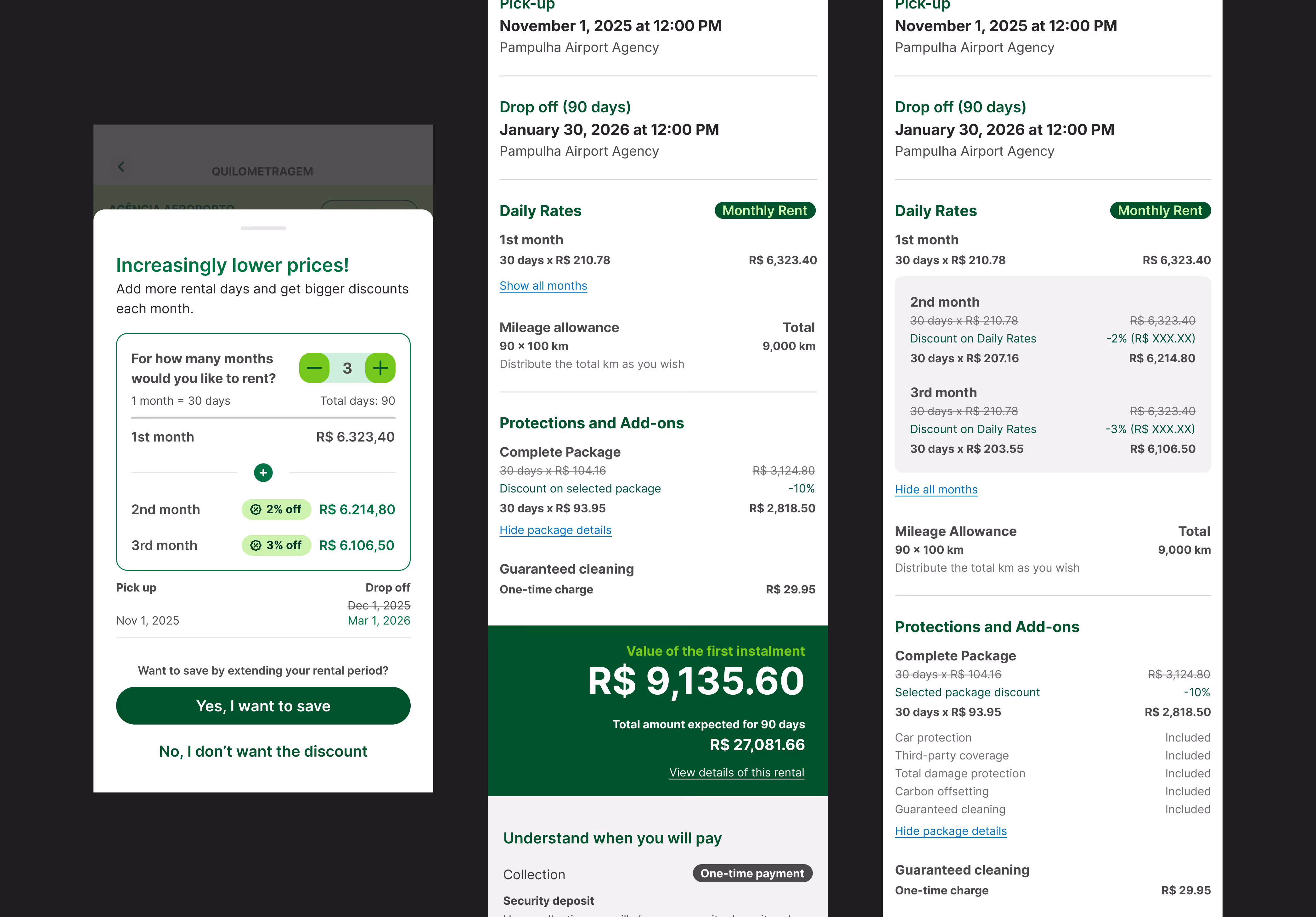
Instead of static information, I designed an interactive calculator that updates the quote as users add months, making the discount tangible immediately.
The UI mirrors how users think: monthly payments, not daily rates multiplied by 30. This single shift eliminated the most common mental model mismatch.
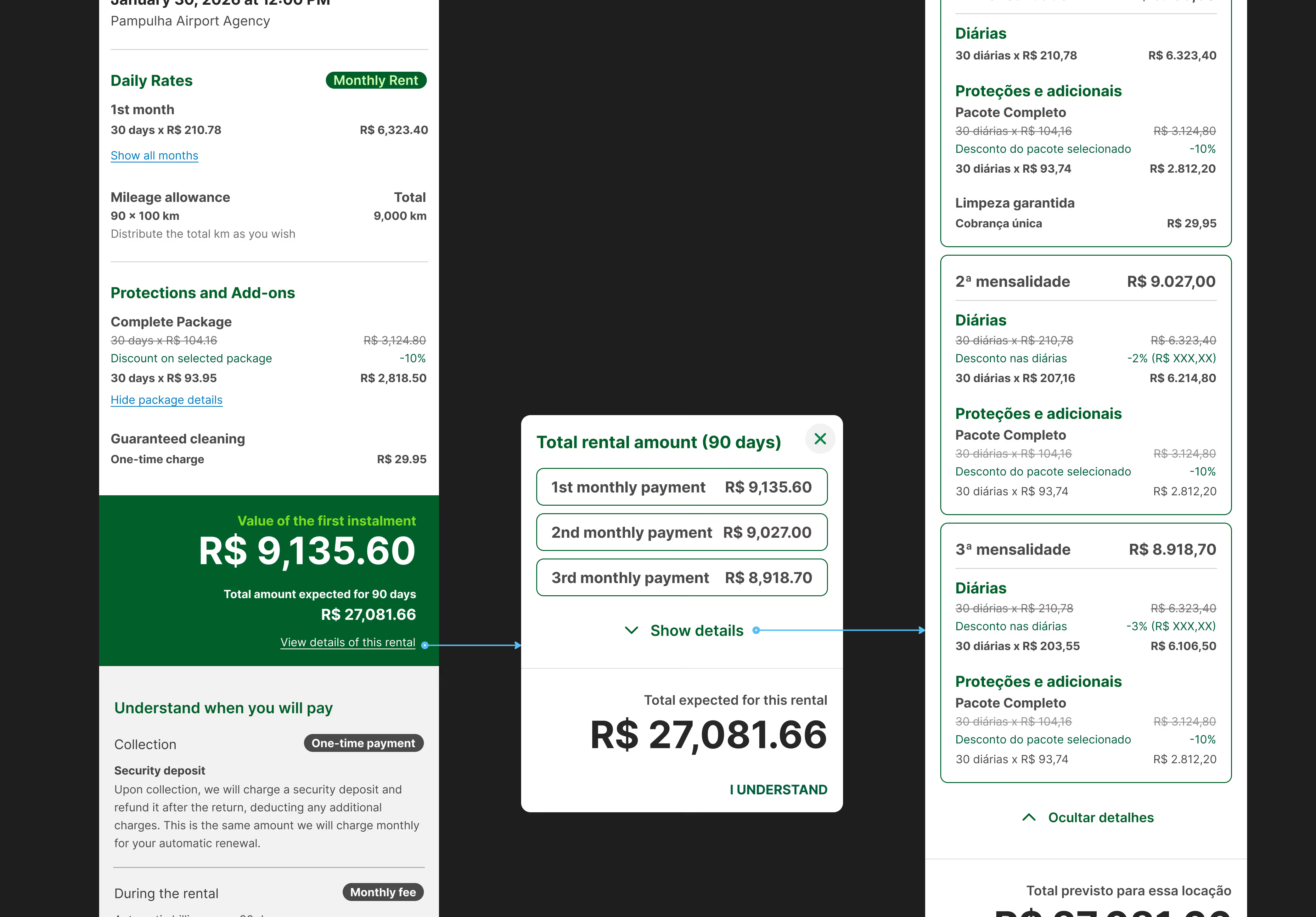
Redesigned the reservation summary to highlight progressive savings structure, not just a single total — giving users confidence in their decision.

Navigating Constraints & Tradeoffs
I joined the project after it had stalled for weeks with minimal design involvement. The pricing squad had nearly finished building their engine with the assumption that design would simply "explain" the discount to users. With only 3 weeks of my availability and 1.5–2 months until freeze, I had to quickly diagnose the core issue, convince teams to rebuild their approach, and coordinate delivery across five squads.
The compressed timeline didn't allow for traditional validation cycles. Design decisions relied on my expert judgment, cross-channel behavioral data, and internal expert feedback from product, engineering, and operations teams. I shaped the solution through design expertise and strategic conviction rather than prototype testing.
When I joined, the pricing engine was nearly complete — but it was built around an "inform-only" model that wouldn't solve the trust problem. I had to convince the team to rebuild their approach to support in-flow quote updates, which delayed their timeline by two weeks but ensured the experience actually worked.
App, web, pricing engine, reservations systems, and chatbot all needed synchronized changes. I established shared principles and a unified delivery cadence to keep everyone aligned without creating bottlenecks.
Impact & Learnings
Business & User Impact
- Over 40% increase in mid-length rentals (41-60 days) and more than doubled long-term rental volume (61+ days) in the first month post-launch
- Long-term rental share grew approximately 4 percentage points — validating that transparent progressive incentives drive duration decisions
- Up to 19% conversion on the in-flow calculator across digital surfaces
- Fewer vehicle yard cycles — cars generate revenue faster with longer single rentals vs. consecutive short bookings
- Established KPI playbook tracking duration distribution, discount discovery, and completion rates
- First-time visibility into progressive savings across online channels
- "What if" exploration before committing — no need to call or re-quote
- Upfront deposit and mileage clarity reducing support volume and booking abandonment
- Proved design drives pricing outcomes — elevated UX's role in commercial execution
- Created reusable transparency pattern for future discount structures
- Created reusable transparency pattern for future discount structures
Next Steps
- Refining comparison cues between per-month vs. total pricing
- Improving legal transparency around deposit and mileage language
Each iteration will be informed by real usage data, not assumptions.
What I Learned
With no time for traditional validation, I relied on cross-channel behavioral evidence, expert judgment, and strategic framing to make confident decisions. The 19% conversion proved that experience-driven design can succeed when backed by strong research foundations.
The two-week delay to rebuild the pricing engine for in-flow quote updates proved essential — within the first month, long-term rental volume more than doubled and booking distribution shifted by approximately 4 percentage points toward longer durations.
Standing firm on core interaction principles, even when it forces technical teams to rebuild their approach, is what separates strategic design from feature factory work. The two-week delay was worth it.
Protecting the MVP boundary while planning future improvements is how you deliver under pressure without sacrificing quality.
Legacy
This progressive discount calculator establishes a foundation for transparent, user-controlled pricing exploration across Localiza's rental ecosystem — a pattern that can extend to subscriptions, insurance tiers, and multi-product bundles.


.svg)